How many logo variations do you actually need for a website? (and when to use them)

Whether you have had a graphic designer create your brand identity or you’re doing it yourself on Canva, you’re going to need a logo.
But did you know that you are going to need more than one type of logo for your website? If you’ve had your branding professionally designed, then you’ve likely had a few variations come back packaged up in jpg, png, and svg files—I’ll be explaining the difference in these file types in an upcoming blog.
The main point here is: One-size does not fit-all when it comes to logos.
When it comes to optimising your content, SEO, website, accessibility, and of course, visual appeal, I recommend four different versions.
So what are the different types of logos?
Primary
Secondary
Submark
Favicon
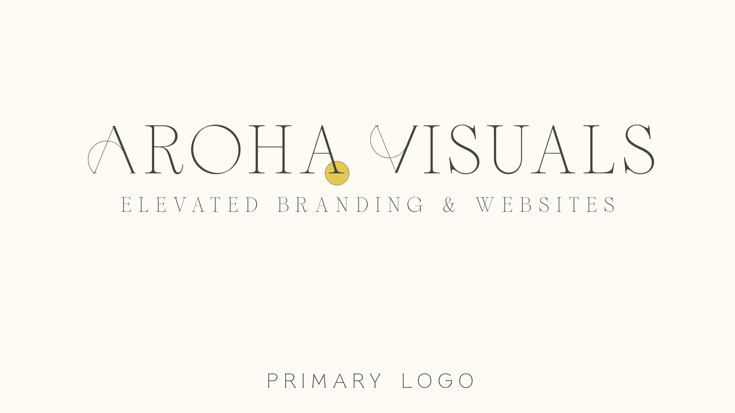
#1 Primary
This is your golden star, your main logo. It’s likely got your business name and a special design element that represents your brand. This could be a crystal for a healing business, a paintbrush for an artist…you get the picture. Everyone has a primary logo, and this is what you use most across your website header, proposals, business cards and in your web footer.
Use this when:
It’s horizontally orientated in your site header as your main logo that will show up on every web page. Hint: Vertical logos usually take up too much space here.
Any pop-ups that offer discounts or newsletter sign-ups
You are creating your e-newsletters
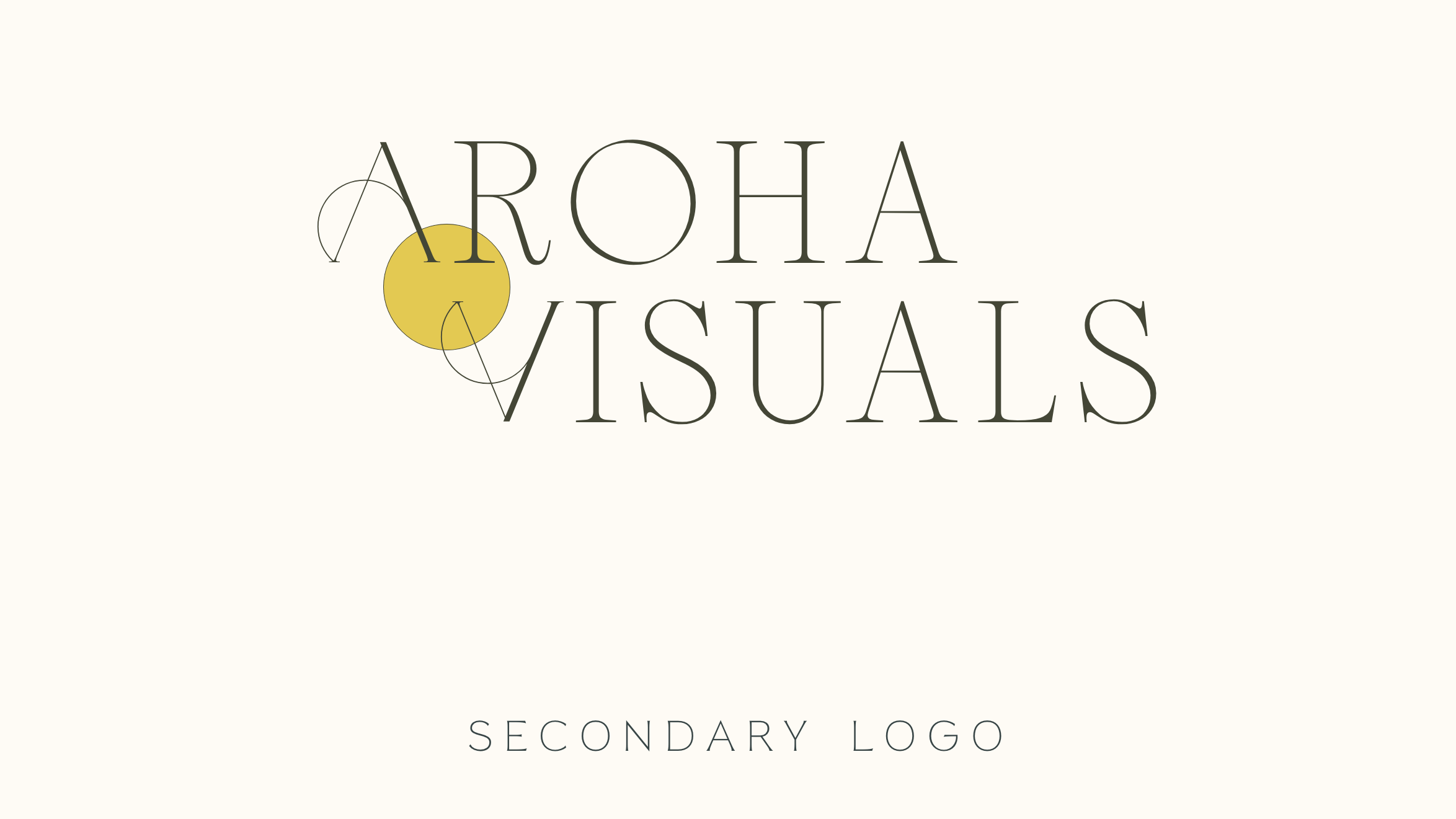
#2 Secondary
This is your main logo in a different variation. This could be a horizontal, square, or even circle shape. Secondary logos are designed so your logo is versatile and fits better in different spaces. This is about legibility, which feeds back into building SEO, accessibility, and all that good stuff.
Use this when:
You need to add a logo in a space that isn't a good fit for your primary logo, but you still need all of your logo information on the page. This could be in your header, footer, or product pages.
#3 Submark
This is a simpler, pared-back version of your primary logo, also called a sub-logo. This might be just the image in the logo or the initials of your brand name. Having a submark is important for brand recognition and flexibility with design. it’s an alternative way for your customers or clients to quickly understand that a pdf, web page, or item is from your business. I would always recommend clients have a submark for their brand, and your brand designer can create this for you.
Use this when:
You need to add your branding to a small space on your webpage, e.g. at the end of a recipe page.
You need to add a watermark to any pdfs or downloadables on your website.
This could be your favicon—but if it has writing I wouldn't recommend it as it's too small to be legible.

#4 Favicon
Also called a browser icon, this is the tiny picture at the top corner of a tab. This is specifically designed to be recognised when people have a million and one tabs open on their laptops. I know that I always search for the colourful Gmail envelope along my google chrome tabs when I’m in a rush. It’s just another way to enhance brand recognition!
Use this when:
You’re adding an icon to show next to your page url on browser tabs, as well as when your page gets bookmarked (yay!)

When you have the right logos for each place on your website, navigation becomes easier, brand recognition can increase, and the overall visual experience of visiting your website increases.
If you’d like support around web design, building a responsive Squarespace site, or creating your brand identity, I would love to hear from you! Tell us what support you’re looking for