5 Tips for freelancers to elevate their portfolio and increase conversion
You can have the most beautiful site with amazing website copy and a portfolio page that really showcases your work and expertise... but how can you go a few steps further to ensure that you're not missing out on any potential or valuable leads?
When I first shared my portfolio page, I received some super valuable feedback from other web designers who'd been in the field a long time. After implementing their suggested changes, I definitely saw an increase in the number of client inquiries. So I'm compiling my tips into this blog post for you!
If you want to elevate your portfolio to increase your conversion rates and customer or client leads, then read on and make sure to implement these 5 easy tips!
Pssst... thinking about DIY-ing your website but not sure where to start? Download my (free) MASTERCLASS:
CONTENT
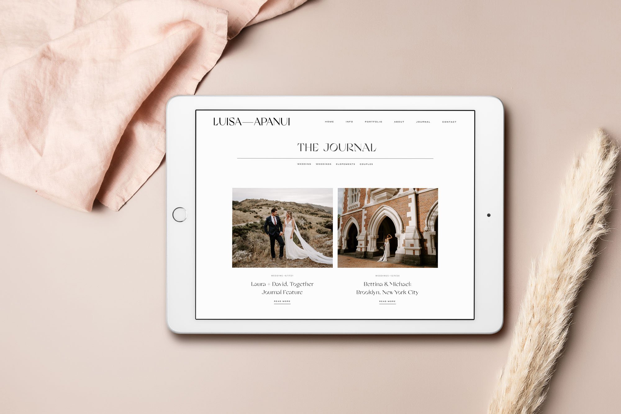
Include high quality images or mockups
Add CTA at the bottom of every page
Focus on the value or transformation
Include Testimonial from clients
Minimize Outbound Links or do this
Include high quality images or mockups
If you have a modern, stylish and chic website... but all your portfolio images were taken with your iPhone or you couldn't afford high quality mockups or say you don't have Photoshop so you just inserted a screenshot... this causes a huge misalignment of your brand identity, which in turn causes a loss in trust.
It's like if you had a super eco-conscious vegan friend who's always talking about saving animals... but then just casually wears a leather jacket? Would that not make you question their values and identity?
When people see low quality photos on beautiful websites, it makes people question the brand's values. Because if you're a brand that portrays high quality work as your core value, then you should value high quality images and visuals as well, no? Especially if you're in the creative industry.
So try to include high quality, professional images - even if that means hiring a photographer. This will boost your Brand's image SO much and help you stand out from your competition.
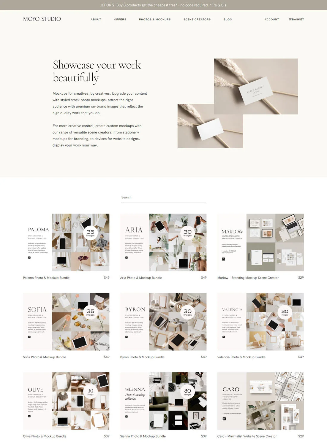
Alternatively, if you're in the digital creative industry, I'm gonna let you in on a little secret... I purchase all my mockups from MOYO STUDIO! You can view their entire collection here:
Add CTA or button at the bottom of every page
Firstly, CTA means Click Through Action. This could be in the form of a button, a link to schedule a discovery call or even just a pop-up form to contact you. Whatever it is, make sure that it's in alignment with the next step of your customer journey.
For most freelancers, this would normally be: WORK WITH ME or CONTACT ME or BOOK A CALL.
It might seem like 'too much' to you, but on average, it takes people to see something 7 times before actually taking action on it! So try to include your main CTA on every page of your portfolio, gallery or case studies!
If you want to test which CTA text drives higher conversion rates, you can A/B split test it by using different works that lead to the same page or form.
Focus on the value or transformation
No matter what industry you're in, I think that there is ALWAYS some sort of transformation or a before & after comparison. Even for visually focused industries like photography.
The transformation could be: how they went from being camera shy to feeling confident during the shoot and loving the final photos. Or the transformation could be the amount of time, energy or stress saved because of your services.
Alternatively, you can also focus on the VALUE of your service. Now that my client has an e-commerce website, they can make passive income while they sleep! They can grow and scale using the SEO strategies I gave them and what's the value of that?! Long term? It's not JUST a website. It's a transformation. It's future possibilities. It's freedom of time and financial freedom.
So make sure you write about the value or transformation your customer or client got (this could be via testimonial or as a case study) because it makes the process more relatable.
It's a journey that people can follow along and think:
"I'm currently where they used to be and I want to be where they are now - I need this transformation myself!".
Include Testimonial from clients
People trust people. So the more testimonials or social proof you can gather, the more trust you accumulate with potential new leads. Trust is the true currency of business.
I know it can feel a little weird and awkward to ask your clients for a testimonial. And sometimes, clients don't quite know how to write or structure a testimonial themselves!
SO... make the process as easy for yourself AND for your clients as possible. How? By creating a new page with a feedback form (you can do this easily on Squarespace) and just send the URL of the page to your clients after the project ends!
Make sure to focus on the TRANSFORMATION, so include questions that prompt what it was like BEFORE working with you and what the possibilities are now AFTER working with you.
It's ok if your client testimonial is quite long because you can just take bits and pieces from each. That way your portfolio will be filled with testimonials that talk about difference aspects - instead of having them all say essentially the same thing.

Minimize Outbound Links or do this
Firstly, an OUTBOUND link is any link that directs people to another WEBSITE. Whereas an INBOUND link is any link that directs people to another PAGE ON YOUR SITE.
Outbound links can be great and even help with SEO, especially in Blog Posts... but when people are on your portfolio page, it already means that they're interested in your services and want to see examples of your work.
If you include too many outbound links (to your client sites, for example), then you risk losing their attention. They might become so distracted that it prevents them from reaching the NEXT stage of contacting you or booking a discovery call.
Having beautiful images or mockups of your client work is usually already enough. You don't necessarily have to include an outbound link to your client's site.
Especially as a web designer, this can often work against you because some clients just LOVE to touch their site constantly and within a few months, it may no longer look like the site YOU designed for them, and sometimes, this can lower your reputation.
So either minimize your outbound links or... if you must, then at least make double sure that the outbound link opens in a NEW TAB so that your viewer doesn't actually LEAVE YOUR site in favour of your clients!
Here's how you can do this in Squarespace!

Let me know in the comments below if any of these tips helped!
I love hearing from you and if you're looking for some valuable resources to elevate your Squarespace site and increase conversions, then pop your deets down below and I'll send them your way! ;) You can also message me here! @arohavisuals.
