5 Tips on how to make your Squarespace website extra mobile friendly

The more mobile friendly your website is, the higher your site will rank for SEO and the more organic traffic you'll get to your site! All this fuss about mobile responsive sites is actually pretty fair, I mean more and more people are viewing websites on their phones - especially when they're commuting or on the go checking out your website from your insta page.
These are valuable leads and you want to make a good impression on them! Just because they're viewing on their phones doesn't mean they deserve to have suuuper tiny text, slower page load or a cluttered site! In any case, mobile phone viewers should have a faster, no-fluff, sleek experience when they land on your site!
I've learnt SO much about designing mobile responsive sites on Squarespace and I'd LOVE to share them with you so that you can elevate your site's mobile experience too!
So, in this blog article, I'll share with you my top 5 tips for a designing extra mobile friendly sites on Squarespace!
CONTENT
Switch to mobile view often when Designing
Customise your header design for mobile
Use media query when coding desktop elements
Hide elements in Mobile view to reduce clutter
Switch alternating elements around in Mobile
1. Switch to mobile view often when Designing
The best and easiest tip for designing mobile friendly sites would be to switch over regularly TO the mobile view. I try to do this after designing every page or every time I create custom code, I double check what it looks like on mobile just so I can account for that at the same time.
And of course, before you hit PUBLISH on your site - I'd recommend going through the WHOLE site on your mobile and checking for anything that looks 'off' or not mobile friendly.
Things to look out for: padding of left and right sides, text size in mobile view, random graphics and cluttering of elements, skewed elements, etc.
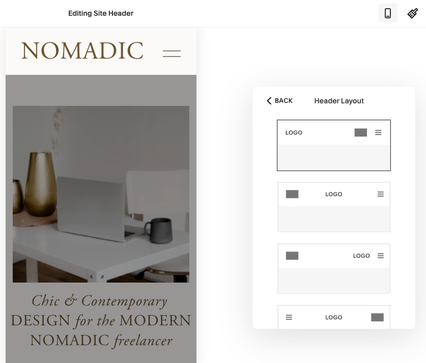
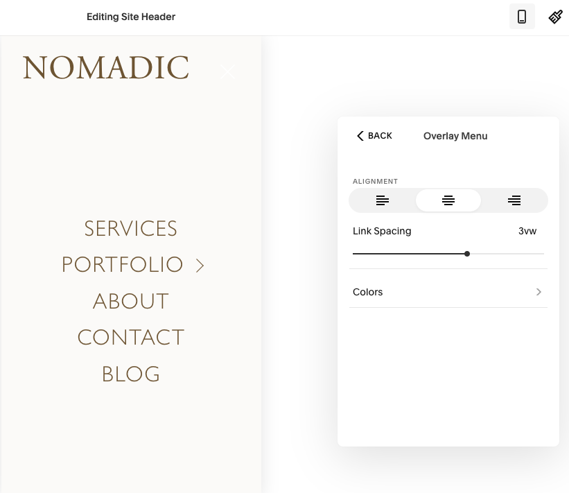
2. Customise your header design for mobile
Did you know? You can customise the look of your mobile header by hovering over your header on desktop → choose the mobile view and make custom adjustments to it there!
You can customise layouts, element spacing, text alignment and even colour! Here's what that looks like!
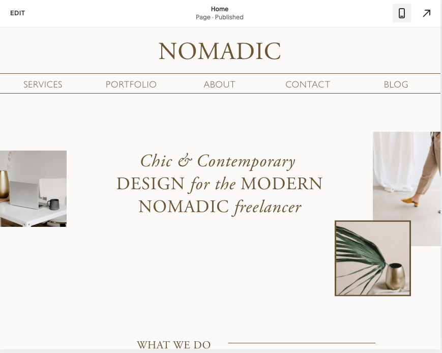
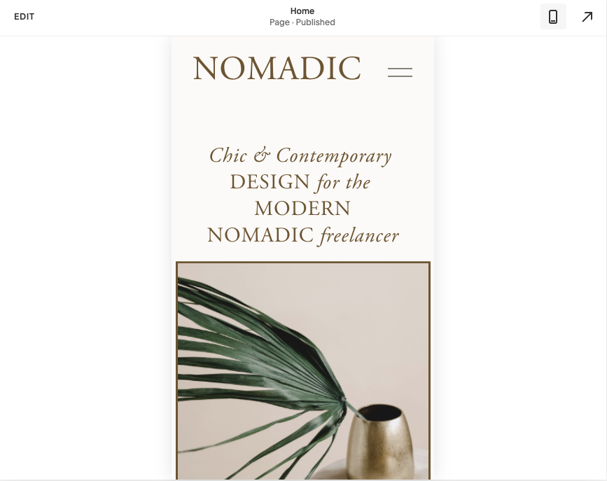
Images of my Nomadic Template
3. Use media query when coding desktop elements
You've probably seen media query codes out there like: @media(min-width: 768px) - such a nightmare to type that out every single time! Ain't nobody got time for that!
So here's my shortcut (and you can thank Rache at Squarestylist for sharing this one with me!)
Go to Design → CSS → copy and paste the following:
@desktop:~"only screen and (min-width: 768px)";
Basically what this does is allow you to shorten the @media(min-width: 768px) to just @media @desktop for all your CSS! - you're welcome ;)
Now when you want to custom code something that is JUST for the desktop view (ie. zero padding left and right) and you don't want this desktop code to affect your mobile view, then simply add the following code BEFORE your CSS snippet.
eg. in the example code below, the mobile view will not be effected at all - only the desktop.
@media @desktop {
  padding-left: 0px; //change this to your code//
  padding-right: 0px; //change this to your code//
}
If you want more CSS snippets, feel free to download my Top 15 Squarespace CSS Cheatsheet
4. Hide elements in Mobile view to reduce clutter
Sometimes we tend to go all out on our desktop view with lots of graphics and lines and special effects. However, we don't really need all this in mobile view because it tends to slow down the site in mobile, which increases bounce rates and brings down your SEO ranking.
So when you're designing for mobile view, just remember that less is more. Reduce as many cluttered elements as you can to make it streamlined, simple and content focused.
To do that, one of the things I do often is HIDE elements in mobile view by using a simple code snippet. Like in tip #3, we will use the shorthand version of the mobile media query:
@mobile:~"only screen and (max-width: 767px)";
Basically what this does is allow you to shorten the normal mobile media query from @media(max-width: 767px) to just @media @mobile for all your CSS! - you're welcome again ;)
Now when you want to custom code something that is JUST for the mobile view (ie. hide this image or graphic) but you still want them to appear on your desktop view, then simply add the following code BEFORE your CSS snippet.
eg. in the example code below, the desktop view will not be effected at all - it will only be hidden on mobile view
@media @mobile {
  #block-ID-change-to-your-specific-block-ID {
    display: none !important;
  }
}
Not sure what a Block ID is or how to find it? I've got you covered in my other blog post here: How to find your Block IDs quickly?
5. Switch alternating elements around in Mobile
One of the MOST common things we'd like to achieve is how to collapse this beautiful alternating design in desktop view... to a non-alternating stacked mobile view?
My cheat way around it used to be create an extra section that would be only for mobile and then use tip #3 and #4 to hide the first section in mobile (so it only shows on desktop) and hide the second section on desktop (so it only shows on mobile).
However... this quickly became very time consuming and I decided to look for a more efficient way of coding it. That's when I came across the amazing mini-course by Squarestylist, which teaches you how to switch alternating columns around with her super efficient codes!
Naturally, I won't be sharing her codes with you because I highly value what she does. So instead, I'll point you to her mini course (only $20 USD), which I HIGHLY recommend! :)

What it looks like on desktop
Not Mobile Responsive

Mobile Responsive

Images of my Nomadic Template
If you're new to the world of CSS coding, then I've got some fun and easy "Copy & Paste" CSS code snippets for you! Just tell me where to send 'em ;)
How do you currently design your mobile responsive sections? Are you using code or workarounds? Let me know if you found this helpful! And if you have any other questions about mobile responsive designs, drop them in the comments below! You can also message me here @arohavisuals.