What are the most important pages you should have on your Website? (the 21-must-have Elements)

Creating a website for the first time may leave you feeling super overwhelmed! There are just SO many factors that work together to make a great website and sometimes it’s the little things that get forgotten - but make a huge difference.
After having created and analysed more websites than I can count, I’ve compiled a list of what I think are the most essential pages and elements that every website should have - and why :)
STRUGGLING TO GET LEADS FROM YOUR WEBSITE?
Top Essential Pages
Apart from the obvious home page and pages like your services page (if you’re a service-based business) or products page (if you’re selling products) - these are the pages you should also have.
1. About Page
This is where people come to find out more about your or your business. Use this as an opportunity to show them how you can help your reader - and not just as an outlet to ramble about your life.
Introduce your team if you have one and definitely include friendly portrait shots so that people can put a face to your business. It helps build trust.
Tip: tell your story in a way that links back to your business or offering. What made you do this, how did you come about it, what inspired you?
2. Contact Page
Where people can reach out to you with questions or even enquire to work with you! So it’s incredibly important to have your phone number, email address and even location on there - for people to contact you.
Tip: to keep things more organised, add a submission form for people to fill out and prompt them with subject lines (eg. do you have a website? If so, what is your URL?). Then link that to your business email or create a Spreadsheet.
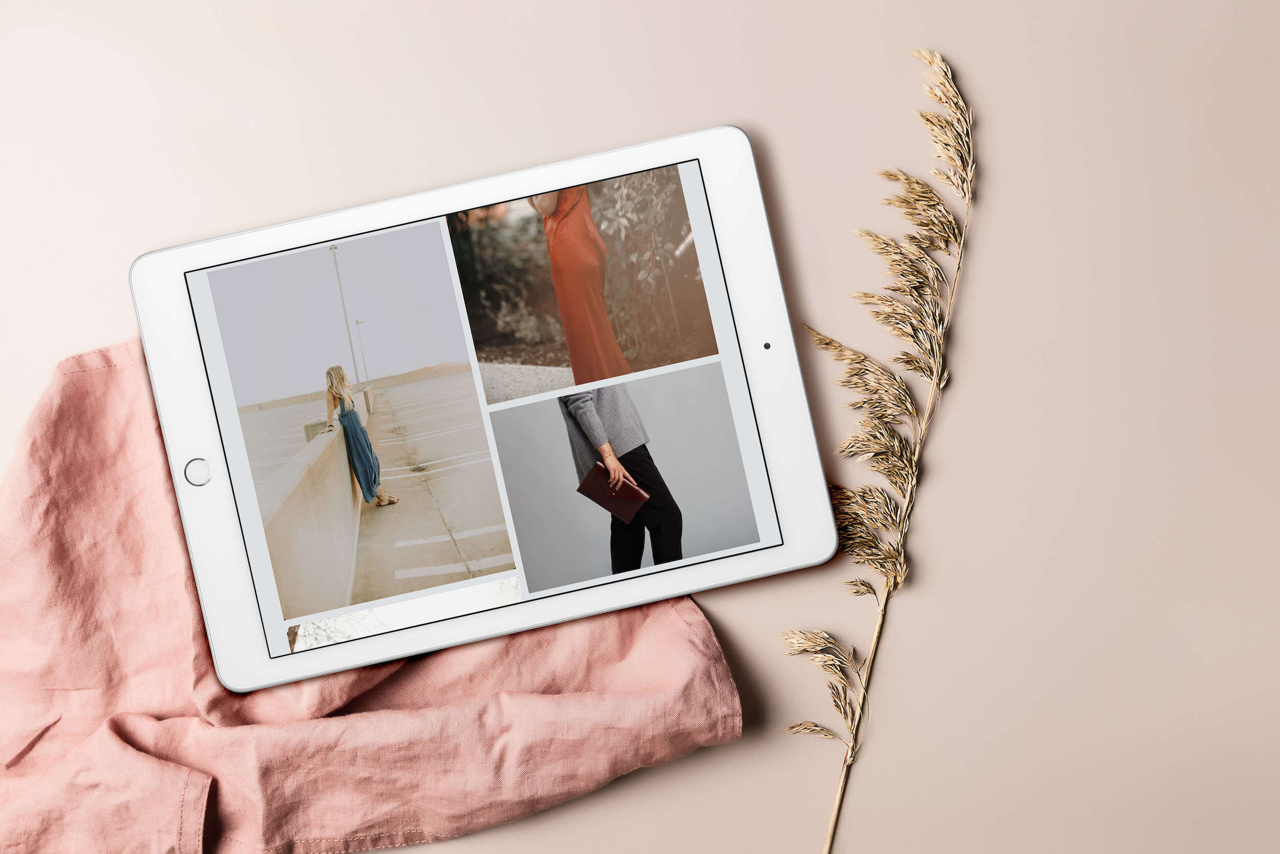
3. Gallery or Portfolio
Whether you’re a creative selling products or services, I feel like a Gallery or Portfolio page never goes astray. It showcases your style and gives the reader a better idea of your work.
Tip: you should call it a portfolio if you’re trying to showcase a service that you’re selling. But if you’re wanting to showcase a product or just examples of your work on display - then go for gallery.
4. FAQs or Extra Info
Super handy page to have that saves you A LOT of back and forth emails with potential clients or customers. Simply take the most frequently asked questions and answer them all on this particular page.
This saves you so much time as you can simply direct them to find their answer on your FAQ page. If you sell products, you might call this: Delivery and Shipping Info, or Refunds page, or an Extra Info & Help Page.
Tip: try anticipate the potential questions you might get asked or pool some of the info you couldn’t fit on your sales/services page and pop them in your FAQ
5. Terms & Conditions
An often overlooked but legally important page to have is your Terms & Condition. It applies to everyone who visits your website and basically outlines in detail what they are allowed to do and not do with the content on your page.
Meaning that, people cannot just come in and copy your work - because the terms and conditions state that it would be illegal to do so. Now, if you didn’t have this page and someone was to steal your work… then it' would be a little hard to justify that if it turned into a legal pursuit matter.
Tip: You don’t have to write it all yourself or hire a lawyer! You can find terms and conditions templates for free online - and have it filled out and ready to go in minutes! Just make sure it actually applies to your industry!
6. Privacy Policy
A lot of people get confused between Privacy Policy and Terms & Conditions. So T&C applies to how others use and navigate your website. While Privacy Policy is how YOU use the information from THEM.
This includes their email addresses (if you have a subscribe form), so you have to let people know ‘how’ you’ll be using this information. Will it be kept safe? Will you share their email with other people? (hopefully not).
Also things like cookies and tracking what they do on your page - and these are all super useful information to you because it shows you which pages are most popular, how many people click through and sign up, etc.
But… it’s important to disclose how you’ll be using all this info. And in some countries it’s mandatory to have this page.
Tip: again, you can find heaps of free templates online - you definitely don’t have to come up with this page on your own!
Gallery Page - Sustainable Fashion Lookbook
Designed by Aroha Visuals
Important Design Elements
Along with essential pages, there are certain design elements that are just as important and it’s these little things that come together and actually make a huge difference to the User Experience.
7. Header with Logo
Your logo doesn’t have to be anything fancy. It could also just be your business name with a distinct font style - but just make sure that this is consistent through out your website.
The ‘logo’ on the header is also very often used as the ‘return to home page’.
8. Navigation panel
These are your top pages, which you want to direct people to. The biggest mistake most people make is having too many options on their navigation panel. This overwhelms your viewer, so keep it simple!
Think about what your website goals are. What do you want your readers to do? Read your blog? Sign up for your newsletter? Buy your products?
Tip: my rule of thumb is to have max. 5 pages in my navigation. No need for ‘Home’ because you can use your ‘Logo’ to redirect the readers back to your home page.
9. Submission Form
Forms are just great to have in general and helps you to narrow down on the specificity of the problem or enquiry. I would definitely recommend having a submission form on your contacts page (esp. for service-based enquiries).
Tip: if you’re doing a survey or tracking responses, you can integrate your Squarespace Forms with Google Spreadsheet, so that every response that comes in, automatically gets added to the Spreadsheet! Magic!
10. Email Subscribe Form
My biggest regret was not having an email subscribe form earlier… and even more so, not putting in the effort to get more subscribers. Learn from me and definitely get one up and going!
Tip: If you ever plan to sell products or service in the future - your email list is going to be ‘surprisingly’ your best marketing tool. Give people a reason to sign up other than ‘newsletters’. Offer a discount or a freebie :)
11. Social Media Icons
Thankfully, Squarespace has the prettiest social media icons ever! And they make the integration/syncing process so easy! The top three icons I would recommend are: Facebook, Instagram and Pinterest.
If you do videos, then perhaps also Youtube. And Twitter, if that’s your thing. But if you’re not super active on a particular platform, then best not to link it in and just focus on the platforms you are most engaged on.
12. Instagram or Photo Reel
You’ll notice it’s quite common to have an Instagram reel of 5-10 most recent photos pulled from IG. This usually goes either on the side bar or all the way down just before your footer.
Nice way to ‘break things up’ and end your page with some beautiful photos.
13. Search Bar
It’s incredible how many websites don’t have this… but if you’re planning on blogging or you have a lot of pages on your websites (or products), then having a search bar is a must!
Squarespace has a great search bar feature, so easy to add - there’s almost no excuse not to have one either at the top or in your footer!
14. Buttons for CTAs
Who doesn’t love buttons?! Best way to catch someone’s attention and direct them to where you want them. Be a little creative with your CTA (call to actions) - but keep it short and to the point.
Tip: instead of the generic “subscribe”, try something like “ooh I’m in!”. And make the button colour really stand out (ie. accented colour).
15. Categories for Blog Posts
Did you know… apparently search engines crawl and read blog post categories! So what does that mean? It means you can use this as an opportunity to further SEO optimise your blog post by creating categories!
Tip: make it niche-specific. If you’re a web designer writing separate articles for 7.1 and 7.0, then categories them into Squarespace 7.1 and Squarespace 7.0. The search engine will actually take this into account for SEO.
16. Tags for Blog Posts
Unfortunately, tags are apparently not crawled by search engines. But that’s ok coz there’s a huge benefit to creating Tags for you and your readers.
Using tags for your blog post can improve user experience either through the search bar or in the blog post summaries - because it picks up on the keywords in your tags and those tagged results will come up first as recommendations.
Tip: If you’re a web designer writing about Squarespace vs Wordpress, you could tag Squarespace, Wordpress, website platforms, blogging platforms, etc.

Ceramics & Pottery Website - Designed with Aroha Visuals
17. Maps embedded or Location
If you have a physical location, then by all means add your location and why not throw in a pretty map of where you’re based too?
Even if you don’t have an office or fixed location (and move countries every few months - like me), it could still be fun to have a map of where you currently are?
Tip: if you have google business, set up your location! This really helps improve your local SEO rankings so that you actually show up!
18. Footer with links to top pages
Since most websites have more than 5 pages, you obviously can’t and don’t want to clutter up your navigation - so, what do you do? Fit them all down in your footer!
Tip: add your search bar down here and also include your Email Subscribe form too, so that it’s present on every page!
19. Cookies Consent
This is usually a little pop-up or a banner that tells you how cookies are being used. In some countries it’s mandatory to have this and to let the readers know their cookies are being tracked.
Tip: I personally recommend pop-up because it’s easier to exit from. Whereas the banner on the top looks like it’s part of the design, so it’s passively obtrusive. Whereas the pop-up is so actively obtrusive, people just hit accept!
20. Affiliate & Partnership Disclaimers
This doesn’t need a page on its own. It usually comes under Privacy Policy page, so letting people know that you do use affiliate links, but that it won’t affect the reader. In most countries, you have to declare this and be transparent about it.
Tip: I usually include the Affiliate and Partnership Disclaimers in my Privacy Policy page, but also on each and every blog post or page where I include affiliate links. I’ll just add a little note at the bottom as a disclosure.
21. Copyright
The last and perhaps one of the most important is your copyright! On websites, most people have it all the way at the bottom in their footer.
Tip: most creatives don’t need any fancy copyright trademark or registration. All you need is really {name} {current year}.
I sure hope you found that useful! Let me know in the comments below if there’s something else that YOU would personally add on!
And before you go, don’t forget to snag this handy checklist for your website!